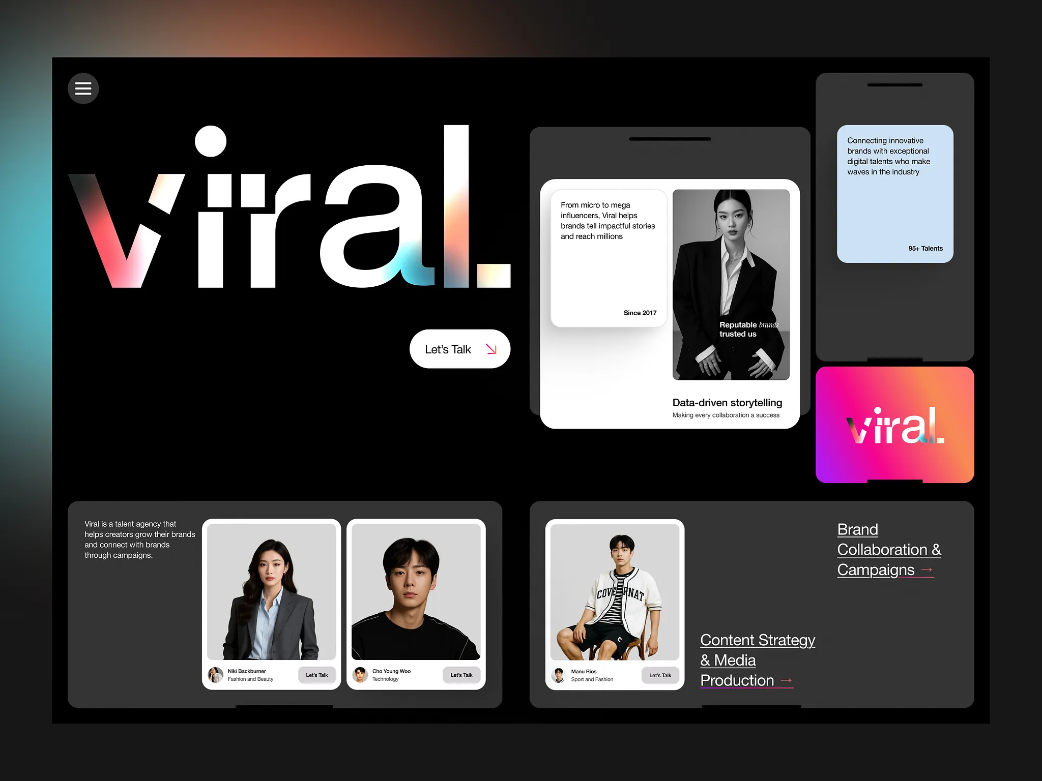
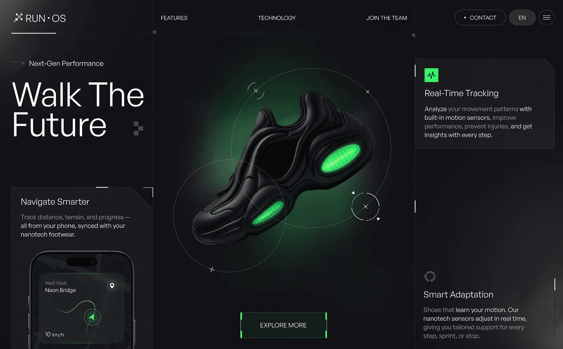
What Makes a Website Feel Premium? (It’s Not Just the Design)
What actually makes a website feel premium? It’s not just trendy design — it’s microinteractions, performance, clean typography, and intentional UX. In this post, I break down the real elements behind a high-end website experience (and how I build them with Framer).
Insights
Jul 22, 2025
What Makes a Website Feel Premium? (It’s Not Just the Design)
Everyone wants a “premium-looking” website. But what does that actually mean?
It’s easy to think that a sleek layout, cool fonts, or dark mode will make your site look professional — but in reality, a truly premium feel comes from a combination of smart UX, smooth performance, and small details that most users won’t consciously notice (but will absolutely feel).
Whether you're a startup building trust or a brand repositioning yourself at a higher tier, here’s what actually makes a website feel premium — and how to achieve it.
1. Polished Microinteractions
Tiny animations and hover effects might seem small, but they add life and feedback to the interface. A button that slightly scales on hover, a smooth transition between sections, or a subtle fade-in — these are details that communicate care and quality.
Framer bonus: It’s easy to build these microinteractions visually — without writing a single line of code.
2. Clear, Confident Typography
Premium design uses typography intentionally. Headlines are bold but not overwhelming. Body text is easy to read. Spacing is generous. Font choices feel aligned with the brand tone — modern, minimal, or expressive.
Tip: Limit your font palette, and make sure sizing and hierarchy are consistent across the site.
3. Speed & Smoothness
No matter how beautiful a design is, if the site loads slowly or animations stutter — it won’t feel premium. Performance is part of perception. A fast-loading, smooth-scrolling site feels more professional.
With Framer: You get speed and responsiveness out of the box, including mobile optimization.
4. Intentional Use of Space
Premium websites often say less, but better. They don’t overwhelm users with text, images, or features. Instead, they use whitespace, clean grids, and focused content to guide attention.
This makes the experience feel calm, clear, and controlled — a key difference from budget-looking sites that try to cram everything into one screen.
5. Consistency in Every Element
Buttons, colors, icon sizes, link styles — when these are consistent across a site, it feels thought-through. When they’re random or change from page to page, it feels unprofessional.
That’s why good design systems are the foundation of premium user experience — and why even simple pages should follow one.
6. Mobile Experience That Feels Native
A premium website works just as beautifully on mobile as it does on desktop — not just in layout, but in touch experience. Buttons should be easy to tap, animations should adapt, and navigation should feel intuitive.
In Framer, I design and test across screen sizes in real-time — making sure your site feels right everywhere.
Final Thoughts: It’s About Perception
Premium isn’t about fancy tricks. It’s about carefully crafted details that feel invisible — but create trust, confidence, and delight.
Whether you’re launching a SaaS product, promoting a creative studio, or pitching a new idea, your website is often the first handshake. Let’s make sure it feels like one that matters.