Landing Page Mistakes That Kill Conversions (and How to Fix Them with UX)
Your landing page might be killing conversions without you even realizing it. In this post, discover 5 common UX mistakes startups make — and how to fix them using smart design and Framer. Improve clarity, boost trust, and turn visitors into users.
Tutorials
Jul 23, 2025
Landing Page Mistakes That Kill Conversions (and How to Fix Them with UX)
Your landing page is often the first impression someone has of your product — and in the world of startups, that first impression can make or break a conversion. You might be running ads, getting clicks, or bringing in traffic... but if your landing page isn’t working, all that effort goes to waste.
Let’s look at the most common UX mistakes that silently kill conversions — and how smart design decisions (and tools like Framer) can fix them.
1. Unclear or Weak Call-to-Action (CTA)
The problem:
Users land on the page and don’t know what to do next. There are too many buttons, or worse — none at all that stand out.
The fix:
Use a single, focused CTA per screen
Make buttons visually clear and use action-oriented language (“Start free trial” > “Learn more”)
Place the CTA above the fold and repeat it strategically throughout the page
2. Overloaded Layout (Too Much Stuff)
The problem:
Trying to say everything at once leads to cognitive overload. Users leave because they don’t know where to look or what matters.
The fix:
Focus on one key message per section
Use whitespace to create breathing room
Remove anything that doesn’t support the main goal (even if it looks “nice”)
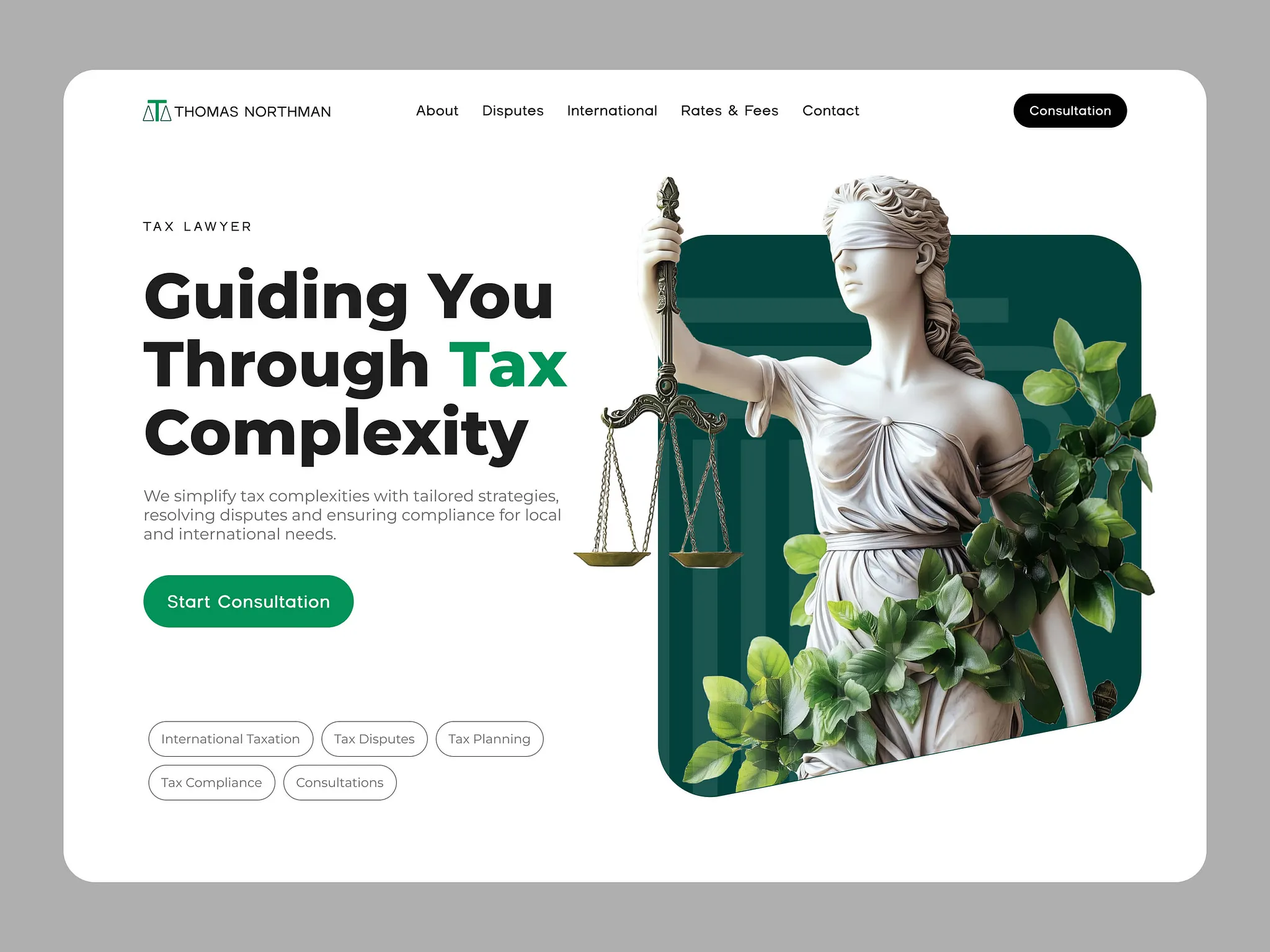
3. No Social Proof or Trust Signals
The problem:
If users don’t know you yet, they need something to build trust — fast. Without testimonials, logos, or real examples, they won’t feel confident.
The fix:
Add real customer quotes, logos of partners/clients, or product screenshots
If you're new, even a “Backed by founders from [well-known companies]” line can help
Use consistent design to make your brand feel more credible
4. Poor Mobile Experience
The problem:
Most users will visit your landing page from their phone. If it’s slow, hard to read, or breaks — you’re losing leads.
The fix:
Test your layout on all screen sizes
Optimize for speed (Framer does this well out of the box)
Use large enough text, tappable buttons, and avoid scroll traps
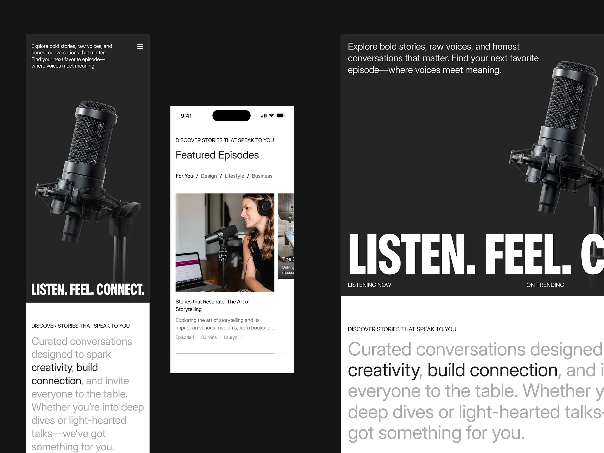
5. No Clear Visual Hierarchy
The problem:
Everything looks the same — headlines, body text, images. Users can’t scan the page or quickly understand the value.
The fix:
Use contrast, font sizes, and spacing to guide attention
Make sure every section has a purpose and a clear takeaway
Break long paragraphs into digestible chunks
How I Help Fix These with UX + Framer
As a UX/UI designer and Framer developer, I help startups turn confusing, underperforming pages into conversion-focused experiences. With Framer, we can design and launch fast — testing real ideas, improving performance, and making your product shine from the very first visit.